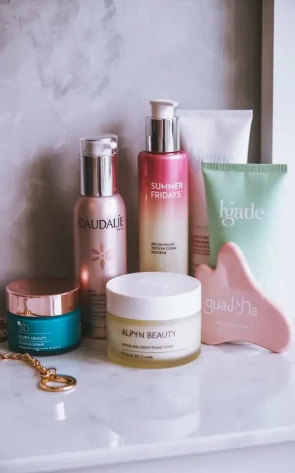
Searching for the perfect skincare shelfie ideas usually starts with a scroll through social media and ends with you staring at your own bathroom counter, wondering why it looks like a chaotic apothecary exploded. I’ve been there. The good news is that pulling off a polished, luxury look has very little to do with how much money you spent on serums. It’s all about the arrangement. The photo that started this whole post is a perfect example: a handful of products on a white marble surface, and honestly, it looks like a million bucks.
The best part? The skincareshelfie layout in that picture is completely copyable, even if you’re starting with a modest collection. It’s not about having every high-end brand under the sun. It’s about understanding a few simple rules of visual placement. So, look, I’m going to walk you through exactly how to recreate that vibe, using the specific products from that photo (Caudalie, Summer Fridays, gua sha, the works) as our guide. We’ll break it down step by step, assuming you’ve never styled a shelf in your life.
Why This Specific Skincare Shelfie Layout Works So Well
Let’s talk about why the photo looks so good before we even touch a bottle. The image isn’t just a random grouping of products; it’s a carefully balanced composition. You have the tall, frosted glass Caudalie bottle providing height, and then the compact, chunky Summer Fridays pump acting as a solid anchor. Mixing tall bottles with short, wide jars is the oldest trick in the visual merchandising book. It stops the eye from getting bored.
Now, take a closer look at the details. The grey textured wall behind the white marble adds a subtle warmth that prevents the scene from feeling too sterile or clinical. It’s a soft backdrop that lets the pink tones in the “CAUDALIE” label and the “SUMMER FRIDAYS” gradient bottle stand out brilliantly. That’s a key lesson here, your background matters just as much as your foreground. If your wall is a loud color, the products get lost, no matter how beautiful they are.
Arranging Luxury Skincare Products on White Marble
Luxury skincare products look incredible on marble, there’s no denying it. The cool stone surface immediately adds a spa-like, expensive feel to a simple moisturizer. However, if you don’t have a solid slab of white marble lying around, don’t panic. I’ve used a large marble serving tray from a home goods store for years, and it works perfectly. Alternatively, a marble-style contact paper adhered to a piece of wood is a great budget hack.
But even the best surface won’t fix a sloppy arrangement. Start by building a triangle with your tallest item in the back. In the photo, the Caudalie elixir sits proudly, acting as the peak. Then, in front of it, you create a lower, wider line with the jars. You want to create depth, so don’t put everything in a straight row. Tuck the smaller items, like the mint green tube, in the gaps between the taller ones. This is the exact formula that gives the photo its effortless feel.
Make the Pumps Face Front for Better Flow
Here’s a tiny detail that elevates a good shelfie to a great one: the pump direction. It sounds absurd, I know, but directing the nozzles of your bottles to face the front is a game-changer. In that photo, the Summer Fridays pump is pointing straight ahead, and it instantly makes the product look more intentional. It’s like the products are presenting themselves to you, ready for use.
This isn’t just for aesthetics, either. It’s a practical function. When you reach for your daily moisturizer, you don’t want to be twisting the bottle around to find the pump. Keeping the action point facing forward makes your morning routine smoother. It seems like a small, weird thing to obsess over, but once you start noticing it in magazines and high-end marketing photos, you’ll see it everywhere. It gives the layout a professional finish.
Skincare Organization: Pairing Textures and Finishes
During the entire skincare organization process, look at the material makeup of your bottles. Think about the glass versus the plastic. The frosted glass of the Caudalie bottle feels heavier and more premium. The soft-touch plastic of the Summer Fridays tube feels modern and clean. You want to mix these up. Don’t cluster all your glass bottles together and then all your plastic tubes together. Weaving them together makes the overall collection look curated rather than just collected.
In the inspiration photo, we see the smooth glass of Caudalie alongside the matte the pink gradient of Summer Fridays. Then, to break up all that softness, you have the rigid, cool texture of the pink gua sha tool. This is smart skincare storage because it’s treating the tool as part of the visual landscape, not just an odd object shoved in a drawer. The contrast between the rigid stone (or plastic) tool and the soft curves of the skincare bottles is visually satisfying.
How to Group Products and Edit Your Collection
This is where we get a little Marie Kondo-esque, so bear with me. The shelfie in the photo has a specific color story: pinks, whites, mint, and earth tones. It doesn’t have a random neon green tube or a bright orange bottle ruining the vibe. When grouping, you should look for the dominant colors on your own shelf. I had to hide a really effective acne treatment because it came in ugly red packaging, it just broke the whole mood of my shelf.
So, start by pulling everything out. Group your products by height, then by color. Don’t feel obligated to display every single item you own. If you have a collection of serums with mismatched labels, perhaps tuck the ugly ones into a pretty catchall bowl or a cabinet. The goal of a shelfie is not to show how much stuff you have, it’s to show a curated aesthetic that works together. Sometimes, the most powerful thing you can do is leave empty space on the tray. That emptiness signals luxury, a lack of clutter.
Creating the Perfect Gua Sha Display Setup
Now, let’s talk about the pink gua sha resting on the marble. It isn’t just lying there randomly; it’s angled to catch the light and act as a counterpoint to the round bottles. When displaying your gua sha, give it room to breathe. Don’t cram it behind a bottle. Instead, place it in the foreground, almost like a piece of jewelry on display. That curved shape against a straight line (like the edge of the marble tray) creates a really pleasing dynamic.
Setting up a gua sha display like this also serves as a visual reminder to actually use the darn thing. If it’s buried in a drawer, you won’t use it. I started putting mine right next to my moisturizer, and I’ve been way more consistent. The photo shows it resting almost casually, ready to be picked up. That’s the energy you want to recreate. It’s functional art.
Practical Skincare Storage Rules to Steal
Let’s get down to the nitty-gritty of the placement strategy. Here are the simple rules I use to style my own vanity now, so you don’t have to think so hard about it:
- Place your tallest products in the back row, slightly overlapping the ones in front to create depth.
- Keep frequently used items, like daily moisturizers and sunscreen, on the top layer or at the front. Don’t bury them.
- Teaming up products with similar color labels helps a shelf look less chaotic, even if the brands differ.
One more thing, the little extras matter. See that blue jar with gold accents and the gold keychain in the far left of the photo? That tiny pop of a different color is called a “focal point.” It draws your eye and adds a hint of personality. Without it, the layout can feel a bit too staged. If you have a special keepsake or a pretty candle, including it in your shelfie can make the whole setup feel more personal to you.
Final Thoughts on Styling Your Own Shelfie
The truly wonderful thing about this entire setup is that it doesn’t require a huge bathroom renovation. You just need a small tray, a designated corner, and the confidence to arrange your bottles with a bit of intention. It’s about showcasing your products in a way that makes you happy every time you walk into the room. Take the pressure off yourself to make it perfect on the first try. You’ll move things around a few times, and that’s okay.
So, grab a few of your favorite products and play around with the layout on your counter. See what feels right to you. Don’t be afraid to mix in unexpected elements like a pop of color or a curved tool. And hey, if you manage to nail that perfect shelfie using these tips, I’d love to hear how it turned out. You’ve got this.
Leave a Comment